Case Study Part 2: LeAnn's Amish Sampler Medley Quilt
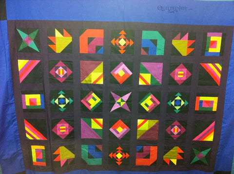
Yesterday I shared part 1 of this case study so you could see the design choices she selected. Now we'll look at the next step.
Here's the quilt.
I took a photos of the quilt and brought it into Photoshop so I could drawn on the photo. This lets me audition placement and gives me a better sense of any secondary patterns that I might be able to emphasize with the quilting.
The thing that jumped out at me right away was how the block layout revealed a diagonal frame that extended into the outside borders. I've drawn out the border so hopefully you can see where I'm headed.
Next I dropped in a design into the center block to audition using separate designs in each block. However, this approach just didn't work for me. It seemed a little, I don't know, predictable. I really thought the block placement allowed for the opportunity to use the quilting as a completely different layer. I love it when you see a quilt where the quilting comes out as a whole new visual layer floating on top of the piecing. More on that in the next post.
Take a look at the rest of this case study. You can see part 1 here, this post is part 2, part 3 here and part 4 here.

I’m Angela- Co-host of the Fons & Porter’s Love of Quilting PBS show. APQS Long arm Dealer and Educator. Triplet Momma. Designer. Thread Bimbo.




Leave a Reply