Burning the Edges of a Photo

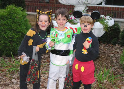
Quilters are visual people, no doubt about it. One of the best tricks a quilter has to enhance a pattern is careful color selection and placement. It is always heart breaking to me to see a quilt where the piecer has obviously spent a lot of time and effort to make a well crafted top but it all falls flat because they forget one thing: contrast. By paying attention to contrast, you can lead the eye around a quilt and really make a statement. I've discovered I can do the same thing in photography. It is called a burned edge! Here is the photo I started with:
Just your basic Halloween shot of a cat, Buzz Lightyear and Mickey Mouse with a parrot, right? I'll bet you didn't even know that one of Mickey's closest friends is a Macaw, did you? See how much you learn here? Now, take a good look at how bright the background is. Do you see how everything is kinda flat because the background is just as defined through light as my kidlets? If we can knock back the background, the foreground will pop up. It is like Trapunto for photos! Here it is with a burned edge, a groovy photo mask and some fun text. Wheee!
Quilted Joy Blog Stop by QuiltedJoy.com for design inspiration, quilting options and pricing on new or used APQS quilting machines.

I’m Angela- Co-host of the Fons & Porter’s Love of Quilting PBS show. APQS Long arm Dealer and Educator. Triplet Momma. Designer. Thread Bimbo.


Leave a Reply