


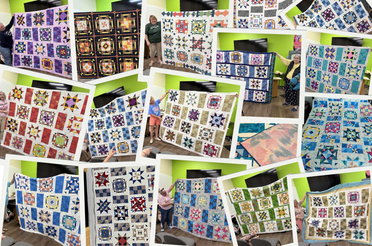
A Valuable Example of Value Placement
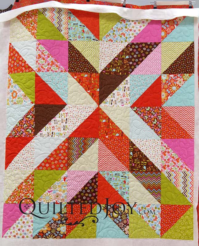
Jan was visiting Pinterest recently and saw a quilt that inspired her to play with value. By "value", I mean light vs medium vs dark shades of colors. Placing light fabrics so that they contrast with dark fabrics can create an entirely new secondary pattern within a quilt. This has been used traditionally with log cabin and split nine-patch quilts, but it is often seen these days in creative arrangements of half square triangle units like in Jan's quilt. 
I must confess that I didn't see this immediately! As a longarm quilter, I am focussed on a limited area of the top at a time, and sometimes the overall pattern isn't obvious close-up. When Jan's quilt was completed, though, I saw the overall effect.

Because there was so much contrast between the lights and the darks, I used a neutral grey thread that blended well across all of the fabric shades AND colors. 
To soften the geometric lines, we selected a floral edge-to-edge design called Periwinkle. Isn't the flower in the pantograph just perfect with the flowers in Jan's fabrics?

With a backing like this, one could hide a multitude of sins. Its multicolor speckled texture on an orange base picks up so many of the colors from the front of the quilt. We often joke that when I shop for fabric, orange-rust seems to follow me around. Here it is again!

Thank you, Jan, for bringing your quilt to me for longarm quilting! 
I’m Angela- Co-host of the Fons & Porter’s Love of Quilting PBS show. APQS Long arm Dealer and Educator. Triplet Momma. Designer. Thread Bimbo.

Leave a Reply