


Longarm Renters Playing with Colors to Make Ombre

Playing with Color with Emily
This is a quilt by Emily. She picked out five blocks from a book called The Quilt Block Cookbook. She then played with colors by choosing four that progressed from blue to yellow. I’ll admit, this is not ombre. But the colors do flow nicely. Using the same white background in the blocks as well as the sashing and borders really draws your eye to the shapes and colors. She quilted this using a paper pantograph called Honey Drops. It covers the quilt with drop shapes and their echoes. It is sort of a modern twist to the traditional feather.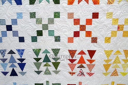

Playing with Color with Layna
Layna made this quilt for her brother. She wanted to create an ocean scene. The different colors of blue becoming paler as it approaches the bottom does give you the feel of the water thinning towards the shore. It is kind of hard to see, but the bottom edge is a sandy color with dots. The pale strip in the middle of the dark looks like the crest of a wave preparing to crash. She created a horizon by simply playing with color and selecting blues significantly lighter to be the sky. It is really gorgeous. She didn’t want to add any additional design to this, so she made the right call by quilting it with Seamless. This is an easy going loopy meander paper pantograph our longarm machine renters can chose.
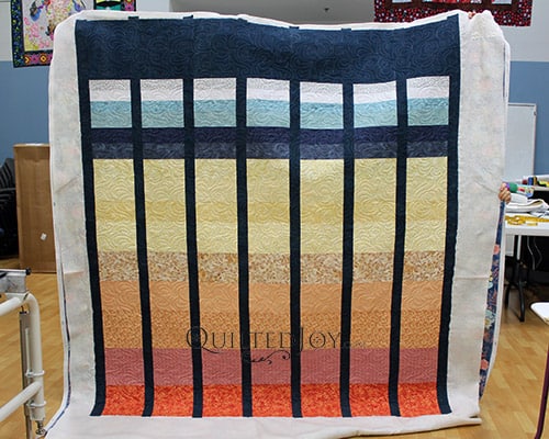
Playing with color with Amanda
Amanda played with some color when she made this lovely piece. She blended fabrics from blue to orange. I remember her saying she wished she had reordered the top blue section to remove the separation that was created between the top blue and the yellow. But I think I like it just like this. It gives it some interest beyond a simple stripe. I think she did an amazing job of picking fabrics. She quilted this with a paper pantograph called Oh My Feathers. It looks like blowing wind to me and adds a lot of curves and movement to this straight top. So lovely. 
There are fabrics, in particular batiks, that have ombre effects in them. They are lovely and very fun to work with. But you can also have a lot of fun playing with colors through the selection of your standard calicoes. By choosing similar colors, but not exact matches, you can blend them like an ombre. It might mean that you need to buy more colors, but then you wouldn’t need as much of each to complete a large piece. Consider playing with colors to get an ombre effect for your next quilt. Then send us a picture over on the Quilted Joy Clubhouse Facebook Group or the Quilted Joy Instagram. We’d love to see what you come up with!

I’m Angela- Co-host of the Fons & Porter’s Love of Quilting PBS show. APQS Long arm Dealer and Educator. Triplet Momma. Designer. Thread Bimbo.

Leave a Reply