How To Combine Free Motion Texture Quilting with Custom Quilting on Kimbra's Quilt
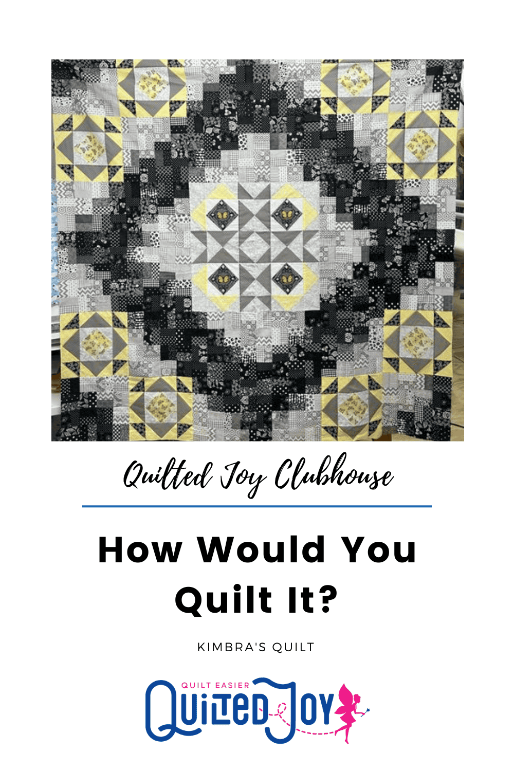
For our first How Would You Quilt It? of 2023 we looked at Kimbra's beautiful, dramatic quilt top. Each month during our monthly Quilted Joy Clubhouse Livestream folks submit a photo of an unquilted top and I pick one to show how I would quilt it. There are so many different patterns in the fabrics Kimbra chose for her quilt. They range from hexagons, polka dots, chevrons, and stripes. It's an absolute FEAST for the eyes. However, with quilts that have this much going on it can be challenging to decide what quilting would best enhance the quilt top.


The problem is that if you use an edge-to-edge pantograph with a definitive motif, for example, a detailed feather pattern like this one that I love, it runs the risk of being too busy or being simply too much against the dramatic colors and patterns. A detailed pantograph would run the risk of adding another design layer that could overpower the quilt instead of just complimenting it with texture.
The January Quilted Joy Clubhouse livestream was all about adding texture through free motion designs, and Kimbra's quilt is the perfect example of how these designs can really make a quilt sing. Be sure to watch the replay as I step out my thought process on her quilt.
Where to Start
In Kimbra's quilt, the individual units are composed of two 2" strips. Each unit alternates orientation. So, one unit's strips run North to South, then the neighboring unit's strips run East to West. I use those seams to align my loops! Don't you love it when the seams do all the hard work so you don't have to mark anything during the quilting process? Her seams break down the space and give me targets which assist with aligning the repeats of my quilting motif. I'm using a lower case cursive letter "L" shape. It adds a repetitive texture, which allows the fabric to do all the talking while the quilting plays a supporting role. Here's what it would look like with an all over texture without stopping for her corner blocks or the center star. It is nice but it diminished the star power of her butterfly blocks. I wanted to encourage the eye to drink them in a bit more by changing the quilting in those areas.

Enhancing the Center Star
Take a close look at how the piecing makes a central medallion in her quilt. The challenge was how to accentuate it and draw the eye to the star formed by those center blocks.


Let's Take a Look at the Corner Blocks:


The Finished Quilt Design:


I’m Angela- Co-host of the Fons & Porter’s Love of Quilting PBS show. APQS Long arm Dealer and Educator. Triplet Momma. Designer. Thread Bimbo.



Leave a Reply